Using stock photography is not always necessary or desired, but we can reference images of real objects to learn techniques for perspective and lighting. In this tutorial, we will be creating an abstract orb. In order to get the highlights, shadows, and perspective as accurate as possible we will study real images to create our own interpretation.
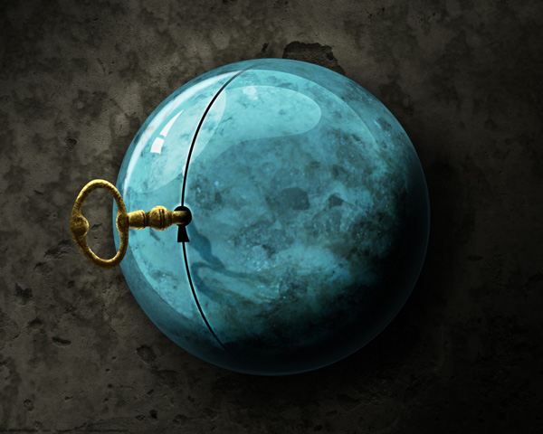
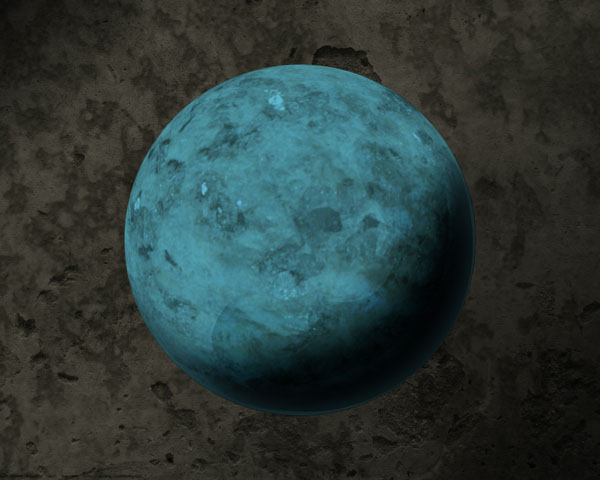
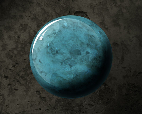
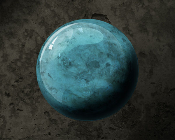
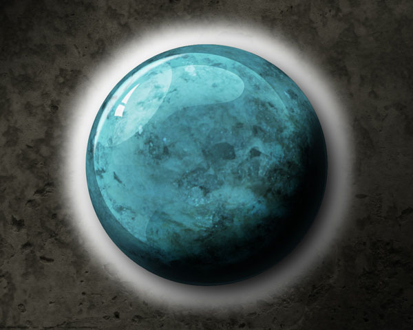
Final Image Preview
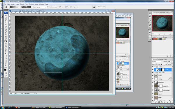
Step 1 - Setting Up the Document
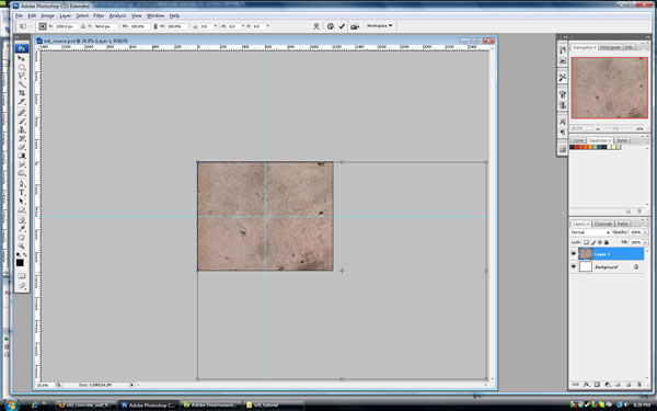
Let's start by creating a new document (1200px by 960px at 300 pixels/inch). Later on we will be creating the orb in the center of the image so create new guides at the vertical and horizontal center.
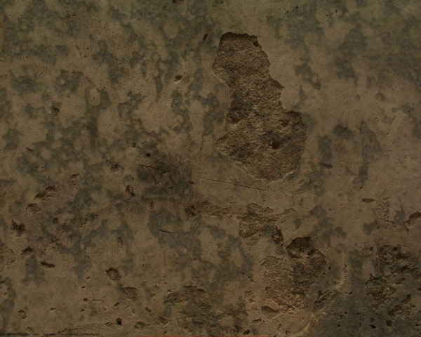
The background color is not important, we will be adding our background to a new layer. Our background will come from an actual photograph of a concrete texture (found
here from
Mayang's Free Textures). The image is a lot bigger than our canvas but that is OK. Right-click and copy it from your browser. Paste the image into your canvas.
In order to resize the image use Command + T to free-transform the image, then Command + 0 to re-zoom our work area to show the entire transform border. Click on the bottom-right drag handle and hold Shift to resize the concrete texture until it is just slightly larger than our canvas. Double-click the Zoom Tool to zoom into 100%.
Step 2 - Touching Up the Raw Background
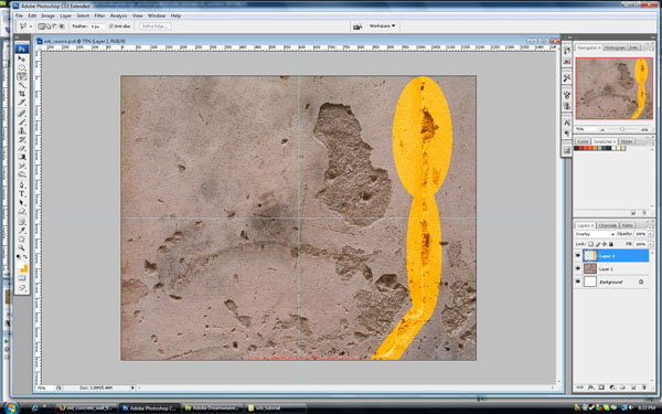
As a touch-up to the raw background, select the Clone Stamp Tool, choose a 200 pixel brush with 0% Hardness. Click Alt and notice the cursor changes to a cross hair, this is the sample point for selection with the Stamp Tool.
We want to get rid of the non-concrete texture (for example, areas with sharp angles). So while holding Alt down, click on an area with a clean concrete texture. Releasing the Alt key will return us to the stamp brush. Paint over the unwanted textures. Repeat this
touch-up until you are satisfied with the resulting texture. The touch-up areas are highlighted in yellow below.
Step 3 - Reconsidering the Background
Sometimes I will just sit and stare at the screen for awhile, not touching the mouse, but just looking at what is on the screen. I decided that I wasn't entirely pleased with the background. This being the case, I will blend one more texture in with the existing texture for more depth and contrast. The second texture comes from
here.
Copy the texture and paste it on top of the existing texture, then resize it using the same method as in Step 1. Set the new texture's blending mode to Multiply. As a final adjustment, lets slightly blur our new texture. With the layer selected in the layers panel, go to Filter > Noise > Median, and use 3px. We may need to adjust it later, but for now we will leave it as is.
Step 4 - Background Color and Lighting
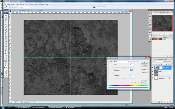
Let's deal with coloring our background and making final adjustments to it. First desaturate the backgrounds by applying a hue/saturation adjustment layer on top of all layers. At the bottom of the layers panel click on the contrast circle (if you hover over the buttons for a few seconds a tool tip will pop-up telling you what the button does).
Take the saturation down to 0%. Since we used an adjustment layer, we can always change the saturation in the future (to do this just double-click the hue icon in the adjustment layer).
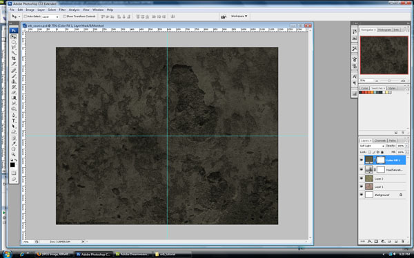
To color the background add a new Solid Color Fill Layer by clicking the contrast circle at the bottom of the layers panel. Choose Solid Color from the menu that pops up. The color I chose is #5d5941, but since we used a fill layer we can easily adjust this color in the future by double-clicking the color thumbnail for this new layer. Set the color adjustment layer's blending mode to Soft Light.
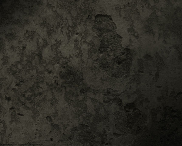
Our source of lighting will be from the upper-left, so it's about time we start creating shadows and highlights that will give the perception of a light coming from that direction. Create a new layer on top of the greenish fill layer. Fill that layer with solid white. Press D and then Command + Backspace to quickly set white as the background color.
My favorite way to create easy lighting on a background is to use the Gradient Tool in conjunction with layer blending modes. Using the Gradient Tool, reproduce the gradients in the figure below. Set the blending mode to Overlay and the Opacity to 65% (second figure below).
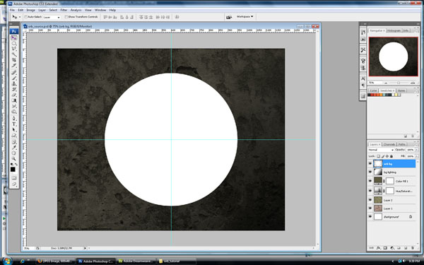
Step 5 - Starting the Orb
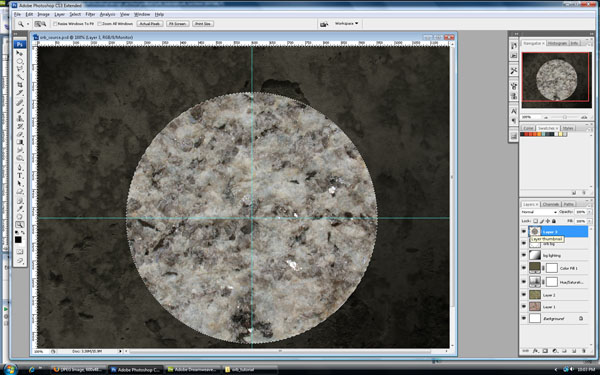
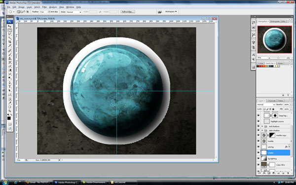
Create a new layer and name it "orb bg." Select the Elliptical Marquee Tool and hold Shift + Alt then click in the middle of the document where the guides intersect each other. This will constrain the selection and create an exact circle that emanates from the middle towards the edges. Usually the starting point is the upper-left of the circle. This method makes it so we can click the center. Once you've made a circular selection with a diameter of almost 700px, fill the selection with white.
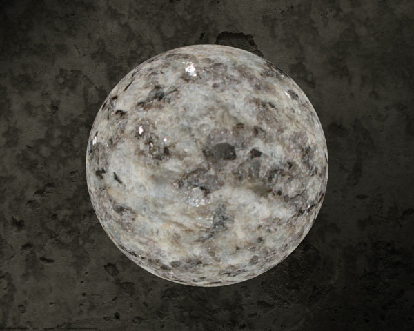
At this point we need some sort of idea of what the orb should look like. Do an internet search for "marble sphere." I wanted the sphere to have an ancient, stone appearance so I'll use an image with a lot of cracking and texture contrast. I like
this image, so I will use it as a starting point, but I will probably add more contrast and texture.
Our first marble texture comes from
here. Copy it, paste it, and resize it to just bigger than our white sphere using the same technique as in Step 1.
Make a selection of the sphere by holding Command and clicking the layer thumbnail for our white orb. We want our marble pattern to be the exact shape and size of the sphere.
Now with the selection ants still marching, hit Command + Shift + I, which will invert the selection. Now we can delete all the marble texture outside of the sphere by clicking on the marble texture in the layers panel and hitting Backspace.
Step 6 - Contouring the Marble Texture
Right now the marble texture looks incredibly unbelievable. It doesn't follow the shape of a real sphere. Looking back at the
reference sphere we can see how the real marble is warped and flows in a circular motion around the sphere, our texture is linear and has no contouring.
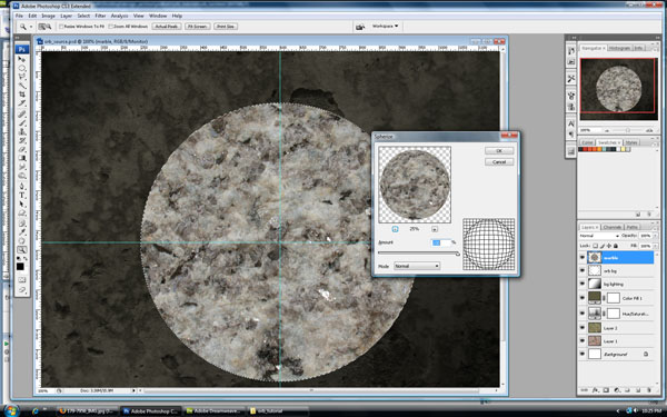
To add some quick contouring let's use the Spherize distortion filter. First Command-click the marble layer thumbnail to select the marble's shape. Now in the menu go to Filter > Distort > Spherize. In the window that pops up, set the Amount to 100%, you can reduce the preview to 25% to get a better idea of how the effect will look.
Click OK and now the marble has a more believable contour. But I still want it to be slightly more contoured. Repeat the spherize filter, but this time use a 50% amount.
Set the marble texture layer's blending mode to Multiply and reduce the Opacity to 70%.
Step 7 - Coloring the Sphere
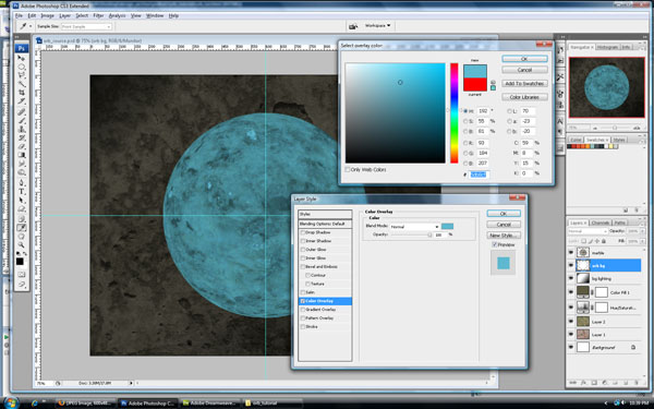
Our sphere is white, and that just doesn't have the pop that I am looking for because we may want to change the sphere's color later. Let's add a Color Overlay Layer Style. Double-click the "orb bg" layer and the Layer Style window will pop open. On the left check the box next to color overlay, it's red by default, just Double-click the red thumbnail and enter in this color: #5db8cf. You should see the sphere change to a teal color. Now we have a good marble sphere as our base, but it is still a bit boring. We need some more inspiration. The sphere needs some gloss!
Step 8 - Adding Gloss to Our Orb
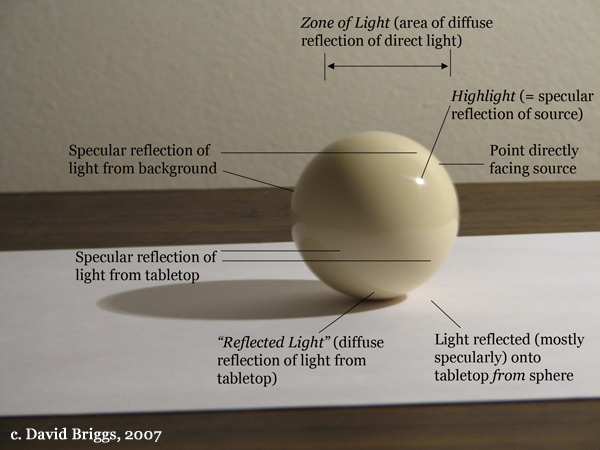
There are tons of tutorials on creating glossy spheres, but what we are after is a somewhat realistic shine and shadows on our orb. Most tutorials are fine for creative website buttons or a slightly impressive glass ball that wouldn't really fit into any artistic context.
What we need to do is do an internet search for
glossy spheres to find
real images of highly reflective marbles or spheres that have a shine that is resultant from a real light source. The first thing I noticed when examining a real image was how many subtle highlights and shadows a glossy sphere has.
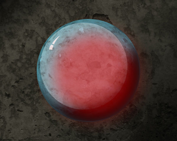
I used
this image as a reference, which comes from
The Dimensions of Color. I will not try and copy the reflections, but I will use them as a
spring board. I'll outline some of my approach here, but I encourage you to put your own interpretation on the lighting effects on the sphere.
There may be a temptation here to use the gradient tool for lighting effects, I'm going to stick with the pen tool, burn tool, gradient masks, and maybe some elliptical marquee tool as well.
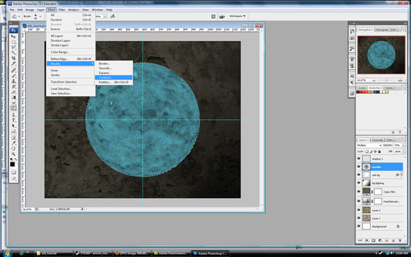
Step 8a - Shadows
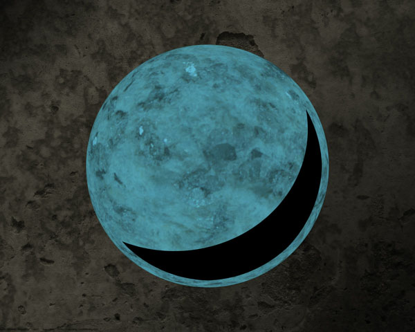
Create a new layer called "shadow 1," with our new shadow layer selected in the layers panel. Command-click the "orb bg" layer to get a circle selection. I don't want the shadow to go right to the edge so I will contract the selection. Go to Select > Modify > Contract and enter 20 pixels.
We want a crescent shaped selection so grab the Elliptical Marquee Tool. Move the cursor to the upper-left and hold down the Alt key (notice the cursor has a little '-' on it now, it will now subtract from the selection). This may take a couple of tries, but look below to see the shape I was happy with.
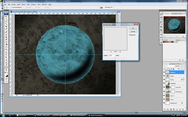
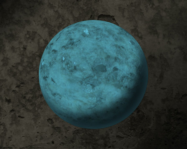
I don't want a crisp shadow so we need to blur it. With our "shadow" layer selected Command-click the "sphere" layer again to get a circular selection. This will limit the blur to the edges of our orb. Go to Filter > Blur > Gaussian Blur and use 25px or whatever suits your taste. Once you have blurred the image, drop the layer's Opacity down to 70%.
Now I want to smooth out the shadow so select the Burn Tool. I set the exposure to 100% and then chose to burn the highlights. Make these edits on the "marble texture" layer. You can see the results below.
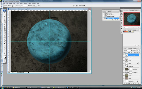
I still don't like the shadow so I let's make one last edit to this region. Change the blending mode of the "shadow 1" layer to Soft Light, but notice how the shadow is lessened. Press Command + J to duplicate the "shadow 1" layer. Let's go ahead and make one more copy of our "shadow 1" layer. Hold Command + J to duplicate again.
Note: As my layers panel starts to pile up, I like to organize them into folders. An easy way to do this is to first select all the layers you want in the group (Hold Command and click each layer in the panel). If you then press Command + G it will create a group that will put all the selected files into that group. Double-click the group's name and then rename it.
Step 8b - Mid-Shadows
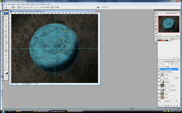
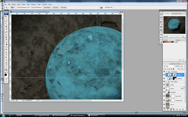
Referencing our
source image again, notice how the sphere has darker shadows that are between the highlights and the darkest shadows. I think it is these intermediate shadows that give the gloss it's real character. Create a new group for our mid-shadows. At the bottom of the layers panel there is a small file icon, click that and then rename the group to "mid shadows."
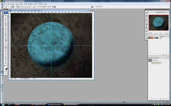
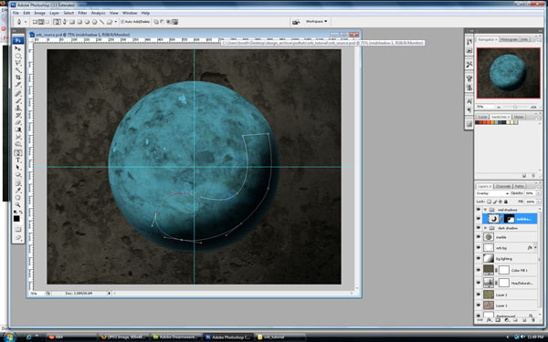
Now this next part assumes you have some grasp on the pen/shape tools. I won't explain how to use them, but I will show the shapes I created. Select the Ellipse Tool. There is one setting I will point out. With the pen tool or any shape tool selected you have a choice of creating Shape Layer, Paths, or Fill Pixels. I am going to choose the Paths setting (it's located under the main program menu). With this setting our tool will create a new layer in the Paths tab of our Layers Panel.
Now that we have a path created we can use it to create a selection. Click on the Paths tab in the layers panel, then Command-click the path layer. We now have a selection that we call use to fill in a new layer.
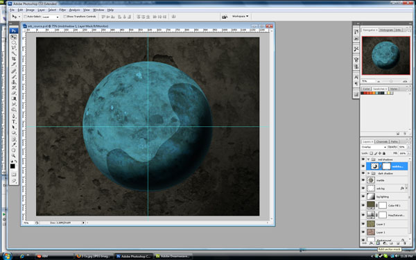
Create a new layer in our "mid shadows" group, name that layer "midshadow 1." Fill the selection with #24231b (you can double-click the background color thumbnail in the tool panel, then use Command + Backspace. Command + D will deselect the selection. Set the blending mode of this layer to Overlay and drop the Opacity to 50%. I don't like the positioning of this layer so I am going to move it down and to the right.
Let's lessen the sharp edges by adding a Layer Mask so we can hide parts of the layer in a non-destructive way. To add a layer mask, click on the third thumbnail at the bottom of the layer's panel.
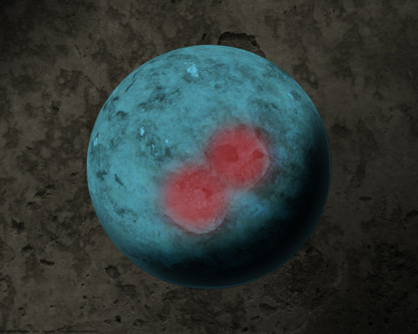
Click the layer mask thumbnail, then select the Gradient Tool. We want a black fading gradient. Use the image below as a guide for creating the gradients. I applied the gradients in two steps, but combined them into one image.
Next choose the brush, size 200px and 0% Hardness. Select black as the foreground color and paint where the faded red paint marks are shown below. I clicked the paint brush about 7-8 times in each position. It may be hard to see the change so hide and show the layer to see the change.
Now we will create the second mid-shadow. Create a new layer and name it "midshadow 2." Create a new shape with the Pen Tool. Use the same process as we did with the first midshadow: create a path, make a selection, fill the "midshadow 2" layer, then create a Layer Mask.
I used this color to fill the layer: #28271. Change the layer blending mode to Soft Light and the Opacity to 50%. On the layer mask I chose the 200px brush with 0% Hardness, then faded both sides of the 2nd midshadow. Be creative with the layer mask, as shown below.
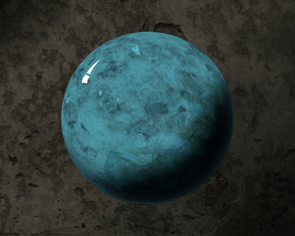
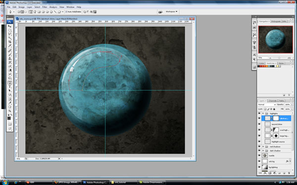
Step 8c - Highlights
Now onto the highlights. When we create highlights we will also be defining the edges of our midshadows (you will see what I mean shortly). Create a new group, call it "highlights" and create a new layer inside this group called "highlight source."
If you look back at our
reference image you'll notice that the highlights have different degrees of sharpness and different distances of highlighting. When we create these new highlight layers their different opacities will interact and the interactions will create their own unique highlights.
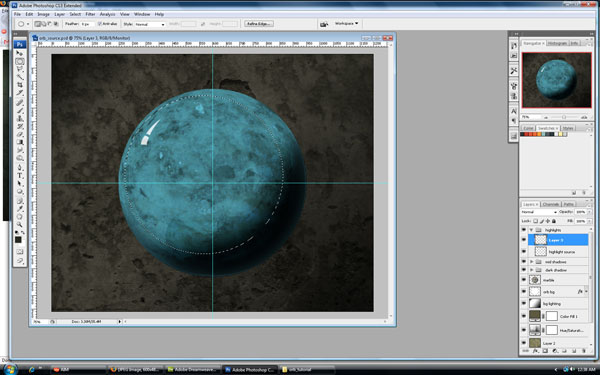
Start with the most noticeable highlight, the light source reflection. This can take on many shapes depending on the shape of the light source. In other words we can just completely make this up. I will be using the pen tool for this step and following the same procedure as I did with the midshadows (with one or two different steps that I will point out). You can reproduce this shape or create your own, it won't make a big difference.
Whatever shape you choose though, make sure it follows the contour of the sphere or it will look fake. Also make sure the reflections adhere to the position of our light source coming from the upper left.
With our new path make a selection and choose the "highlight source" layer, fill the selection with white (#ffffff).
With that layer still selected, change the Opacity to 80% and blur it slightly by going to Filter > Blur > Gaussian Blur. Use a setting of 0.5px.
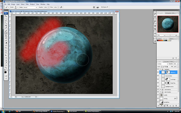
Create a second layer in the "highlights" group and name it "large highlight." You might as well create a Layer Mask on this layer as well. This is going to be our over-all highlight. Make a circular selection and move it to the upper-left of our orb. We want the selection to be a smaller diameter than the actual sphere. Fill this selection in our "large highlight" layer with white. Change the blending mode to Soft Light and the Opacity to 90%.
Choose the brush but this time choose a size of 500 pixels with 0% Hardness. You can see below where I painted on the layer mask (I just used a red brush to show the location - use pure black for your artwork though). I clicked the brush around 16 times.
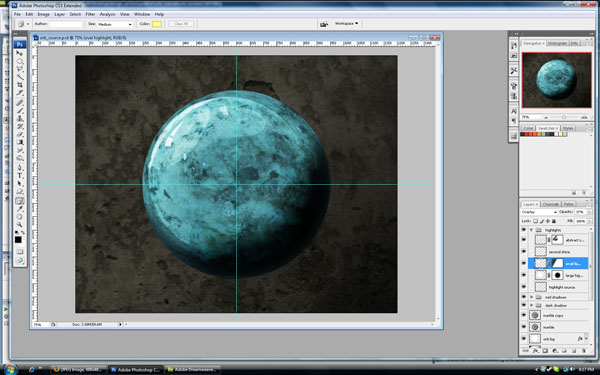
Create a new layer and name it "oval highlight." Apply a layer mask to it. I will be creating this shape with the Ellipse Tool. Just recreate the shape in the images below. Since the path is not at the correct angle, we need to rotate it until it is aligned with the other highlights as shown.
Make a selection from the path and fill it with white in our new layer. Change the blending mode to Overlay and the Opacity to 20%. Go ahead and mask the upper-left edges of this "oval highlight" layer by painting into the layer mask with black. You can choose whatever brush size you want for this.
Our third highlight layer will be similar to the first highlight layer only it will just be a curve. You could accomplish this in multiple ways, but I'll do it using the Elliptical Marquee Tool.
First create a new layer called "second shine." We wont need a layer mask. Make a circular selection, then make a crescent selection. To do this, hold the Alt key down to subtract a smaller circle from our current selection. Click the bottom-right of the canvas and drag towards the upper-left. In our new layer, fill this crescent selection with white.
The new highlight is too sharp, so lets blur it by going to Filter > Blur > Gaussian Blur. I used a pixel setting of about 2.5. Also, drop the Opacity of the layer to 50%.
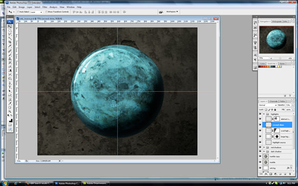
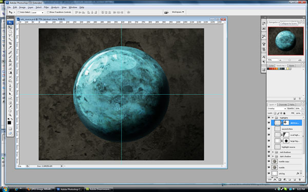
Now for our last highlight. Create a new layer in our "highlights" folder and call it "abstract highlight." Give it a layer mask.
Our
reference image has fairly uniform and predictable highlights and shadows. But if you browse enough images of
glossy spheres on the internet you will notice some spheres have some weird reflections and highlights. Sometimes these come from imperfections of the sphere, other times it could be an add object that is out of the shot, but that is still reflected on the surface of the sphere. This reflection/highlight could be from anything, but it adds a nice asymmetrical feel to the highlights.
Once again I will use the pen tool for this highlight. Below is the shape I will be using to make my selection. Remember that the shape should follow the contour of the sphere as closely as possible, otherwise we lose the realistic feel of the highlight.
Use the shape to make a selection, then in our new "abstract highlight" layer fill the selection with white. Change the blending mode to Overlay and drop the Opacity to 35%. Now paint into the layer mask to blend this highlight in. With a 200px brush at 0% hardness I painted in the areas marked in red.
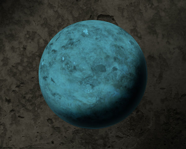
The result is shown below.
Step 9 - Analyzing the Composition
It's time to sit back and just look at the piece and be honest about what I don't like. I rarely ever work on something where each step is the right choice and the final result is a clearly defined linear set of steps. Below is a list of things I don't like so far. Let's fix them before moving on.
- The marble texture seems a little washed out. The teal doesn't seam crisp and there isn't enough contrast to the texture.
- The highlights seems a little cartoonish and separate from the sphere they should be a part of.
- The sphere itself needs some separation from the background. Something other than the color contrast.
These three things should be enough to enhance the overall look before we move onto the key and its parts.
Step 10 - Enhancing the Marble Texture
Lets go back to our marble layer in our layers panel. Click the layer in the layer panel so that it is the active layer. Duplicate the marble texture by pressing Command + J. Our new marble texture layer has a blending mode of Multiply, which yields an unwanted effect. Change the blending mode to Overlay and the Opacity to 40%.
We need to put a layer mask on this new layer and hide the upper-left part of the layer. Highlights on the sphere should wash out the texture they are above so we need to simulate the washing out. Since our bottom marble texture layer is already somewhat washed out, when we hide the top marble layer the bottom one will show through.
Choose a black foreground layer. In the layer mask on our second marble use the gradient tool to fade the top-left of the layer.
Step 11 - Enhancing the Highlights
Now that we have changed the marble texture the highlights don't look nearly as bad, but we may need to adjust the opacity and/or blending modes. In our "highlights" folder click on the "large highlight," change its blending mode to Overlay and the Opacity to 70%.
Select the "second shine" highlight layer and change the Opacity to 71%.
Our "oval highlight" layer is almost invisible so select that layer and change its Opacity to 37%.
Select the "abstract shine" layer and change its Opacity to 50%.
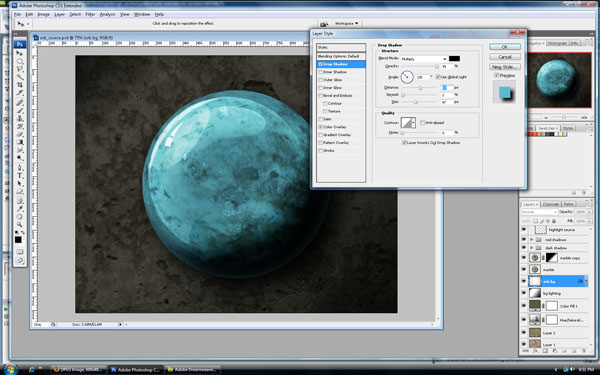
Step 12 - Separating Our Sphere from the Background
Let's venture back to our initial "orb bg" layer. Double-click the "orb bg" layer in the layer panel to bring up the Layer Style window. Start by adding a Drop Shadow.
Use the settings:
- Blend Mode: Multiply (color: black #000000)
- Opacity: 99%
- Angle: 135 degrees (use global lighting)
- Distance: 53px
- Spread: 2%
- Size: 87px
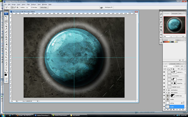
For the last part of emphasizing the orb, I imagined creating some sort of ripple in the background or a crater. It's like the orb put off some sort of power that distorted the ground it was hovering over.
Create a new layer behind the "orb bg" layer and call it "crater." Next, Command-click the "orb bg" layer to make a circular selection. We want the selection to be about 50px - 75px larger than the orb. In the menu go to Select > Modify > Expand and choose a setting of 55px. Select a background color of white, then press Command + Backspace to fill our new layer with white.
A sharp edged crater would look ridiculous so let's blur the edges. Go to Filter > Blur > Gaussian Blur and choose a setting of 25px.
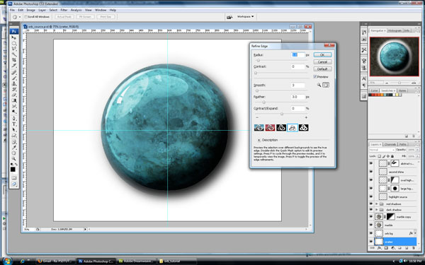
Now we need to make a doughnut shape on our "crater" layer, so Command-click the layer thumbnail to make a selection. To contract the selection go to Select > Modify > Contract and choose a setting of 20px. Before we delete the contracted selection we need to feather the selection edge. Go to Select > Refine Edge.
Use the settings:
- Radius: 1px
- Contrast: 0
- Smooth: 3
- Feather: 3px
- Contrast: 0%
After clicking OK, hit Backspace to delete the selection. We need to divide this new fuzzy doughnut in half so we can create a highlight and shadow. Choose the Polygon Lasso Tool and select the bottom section of the "crater" layer.
We need this selection in a new layer so hit Command + X to cut the selection, then Command + V to paste it. We need it to be black because it is a shadow. Hit Shift + I to invert the color from white to black. Rename this new layer to "crater 2." Apply layer masks to both "Crater" and "Crater 2," then set their blending modes to Soft Light. Fade the edges of both layers by using the gradient tool on the layer masks as I did in the image below.
Step 13 - Creating a Split in the Orb
We need to create the split in the orb that emanates from the key hole we will be creating later.
Above the "highlights" folder create a new folder and name it "key hole." Create a new layer inside this layer and name it "split." Use the Elliptical Marquee Tool to create a selection and fill it with black.
Make sure this new layer is selected, if not Command-click the layer "split." We need to contract the selection, so once again go to Select > Modify > Contract and use a setting of 5px. Once you click OK, press Backspace to delete.
Create a layer mask on the layer "split." I want to delete the right half of the shape and then fade the top and bottom of the split. The areas I have masked off are highlighted in red.
Note: If you ever want your layer mask highlighted, click on the mask thumbnail and press the Backslash key it will toggle the layer mask highlighting.
I want to put a little glow on the edges of the split so double-click the
split layer. When the Layer Style window first opens we need to make a selection in the Advanced Blending section. Select the Layer Mask Hides Effects option. This will allow the layer mask to also hide any Layer Styles we apply.
Now apply an Outer Glow style and use the settings below:
- Blend Mode: Overlay
- Opacity: 81%
- Noise: 0
- Color: White (#ffffff)
- Technique: Softer
- Spread: 2%
- Size: 10px
Step 14 - Creating the Key Hole
I want to create the key hole using the pen tool. Create a new layer in our "key hole" group and call the layer "key hole." We will use the same process of creating a shape, then making a selection with the shape and filling the selection in our new layer.
Move the key hole on top of the split. The key hole's shape is wrong and doesn't follow the contour of the orb so we need to warp transform the key hole. With the "key hole" layer selected go to Edit > Transform > Warp. My warp adjustments are shown below.
I want to add some highlights to the keyhole to give it a little bit of dimension. Double-click the "key hole" layer to bring up the Layer Style window. Select the Drop Shadow option and use the settings below (make sure you have the Use Global Lighting" option turned off, it's next to the angle slider). Use these settings:
- Blend Mode: Overlay
- Opacity: 100%
- Angle: -90 degrees (uncheck "Use Global Light")
- Distance: 5px
- Spread: 6%
- Size: 10px
Step 15 - Adding the Basic Key Shape
I decided to make the key from scratch rather than use a stock photo. This way we are in control of the way it looks. I still did an image search online for
"old key" to get some reference images. I did all the work by hand, but I constantly looked at the real thing to compare. My main reference photo was
this one from the site
worldofstock.com.
First use the Pen Tool to set down a basic key shape, then add details to it and give it a realistic shape.
...and some refinement to the shape
Now create a new layer in our "key hole" group and call it "key base." Create a selection using our path (remember to use the process from Step 8b). Fill the selection with the color: #5b4a16.
Old keys were made out of metals like iron and they had imperfections and a lot more variants in texture than today's keys, so we need a good texture to use for our key. I used
this one.
Paste the texture into a new layer on top of the "key base" layer. If you hold down the Alt key as you hover on the lines between the two layers, then the cursor changes. If you click the layer on top of the cursor, then it becomes bound to the shape of the layer below.
Change the metal texture's layer blending mode to Soft Light, and we are ready to start working on giving the key some dimension and lighting realism.
Step 16 - Giving the Key Dimension
Two main cues to dimension come from lighting effects and distortion of features based on shape. My first techniques for adding depth were the Drop Shadow and Bevel/Emboss effects, which for just clicking a box and tweaking some numbers can be alright... at first. For this key though I think I want to use a combination of the dodge and burn tool, the liquify filter, and the normal brush tool (to add some high contrast depth).
I'll start first by adding the distortions so we have a better idea of where our lighting will appear. Make a selection of each area we want to distort. This will restrict our edits to localized areas and prevent us from affecting past and future edit sites.
Step 16a - First Selection/Distortion
Using the Elliptical Marquee Tool, make a selection of the first bulge in the key. I wanted flat sides, so I then selected the Rectangular Marquee Tool and held down the Alt key to subtract from the selection. The selection is slightly off so I needed to rotate it counter-clockwise by going to Select > Transform Selection, rotate it, then press Enter.
With our selection made, go to Filter > Liquify. Use the settings I have below, but make sure you have Show Backdrop selected in the bottom right so you can see the context of what you're editing. I also made the magnification 400% to better see what I was editing. I just painted in the middle of the selection until I was happy (maybe 4 or 5 clicks).
Step 16b - Second Selection/Distortion
Using the same techniques as in Step 16a, I will edit our second
Bulge on the key.
Step 16c - Third Selection/Distortion
Once again use the same technique on the last area of distortion. On this area I don't think the key is as thick so our distortion doesn't have to be as drastic.
Step 17 - Creating the Shadows on the Key
This step requires more accuracy because we will be using the Burn Tool directly on our texture layer. This is usually referred to as
destructive editing because we are making edits directly to the layer, and we will be at the mercy of the number of History Steps if we need to undo our edits. In other words, we could edit to the point where we could no longer undo some of the edits.
This step would probably be easier with some sort of computer tablet. I'll make do with a mouse though. Select the Burn Tool. We will probably need to do this in 2 or 3 sub-steps using different brush sizes. I will start out with a brush size of 17 pixels, 0% Hardness, with the Range set to Midtones and the Exposure set to 30%. I usually like a lower exposure because it allows me to burn the areas at a slower rate so I can be more gradual with my darkening of the layer.
Since the burn tool is additive, meaning it will make an area increasingly dark as the brush moves over the same spot, I will start with the lightest shadow first, then add in darker areas after.
Step 17a - Adding the Lightest Shadows
The hardest part of the lighting on the key will be anticipating where the lighting will affect the key. Our
reference image has a lighting source that comes from multiple angles - direct lighting in addition to reflective lighting sources. Our lighting is a direct source from the upper-left, so we are dealing with a novel light source and we'll have to edit accordingly.
Try to anticipate areas where the light will hit first - usually edges, then use the opposite side of the key to add the shadows. Remember though, that the orb itself is reflecting light which would probably cause all the edges of the key to have some degrees of highlights, so our shadows will be primarily on the inside parts of the key.
Use the image below to see where I started adding our lightest shadows. Shown below are the areas I edited along with the motion I used when painting with the Burn Tool.
Step 17b - Adding our Mid-level Shadows
Our next section of shadows will overlap a lot of our previous shadow edits, so just keep in mind that these edits will also darken our existing shadow edits.
Use the same settings for the Burn Tool, but change the brush size to 9 pixels. Once again, notice the areas that I edited and the direction of the brush strokes.
Step 17c - Our Darkest Shadows
For our last step of the shadows, we'll add the darkest parts of our shadows. They will also be the thinnest and have the highest contrast so we will be using a brush size of 4 pixels and change the Range to Shadows for stronger darkening.
Below are the areas I edited for this last shadow step. Don't be afraid to use different levels of magnification because this step requires a higher level of detail. For me it's easier to edit smaller areas when I am magnified in on the key at 300% or more.
Step 17d - One Last Layer of Shadow
OK, I lied. We need one last step for the darkest and sharpest shadows. Choose the normal brush with a 2 pixel diameter and 0% Hardness. Use black as the foreground color.
I will only be using this step to add to some of the sharper horizontal sections on the key. Create a new layer in the top of our "highlights" folder and call it "darkest shadows." Paint in vertical motions. After you have done this, you can smooth out the top edges of this layer by whatever means you like best. I just deleted some of the top of the lines, and then used the Smudge Tool to fade it out a little.
Step 18 - Highlights and the Key is Done
Our highlights are going to follow a similar thought process and technique as the shadow steps, only we will use the dodge tool. If you are ever unsure of what a tool is or how it works, just do an internet search for that tool, or refer to Photoshop's help. Many times I will do this in the middle of a tutorial so that I can better understand how a tool works or why I am using it.
Step 18a - Making Our Weak Highlights Strong
As I have said before, sometimes I will just stare at a design or leave it then come back. Usually this will counter my initial joy at what I have created and allow me to be more honest with what needs fixing. In this case, it needs more highlights. The key could stay like this, but it has a worn-out and dull look. I think adding some even more drastic highlights will give the key some luster.
Create a new layer and use a combination of brush strokes and blending modes. The Dodge Tool is going to lose its effectiveness if we use it anymore. Below is an image with just the white painted onto the key. After you paint the white, use the Smudge Tool to smooth and taper the edges of the new highlights. Create a new layer at the top of our "highlights" group and call it "highlights," then Command-click our "key base" layer so that we only paint inside our key shape.
Set the "highlights" layer to a blending mode of "Overlay." Press "Command + J" to duplicate our highlights layer. Then change the copied layer to a blending mode of Color Dodge and an Opacity of 18%.
Step 19 - Grouping the Key and Fading its Shaft
Our key ends at this abrupt jagged edge. To fix this we need to select these layers: "highlights copy," "highlights," "darkest shadow," "metal texture," and "key base." Make sure all these layers are selected at the same time, then press Command + G to put them all into a group. Name the group "key."
Add a layer mask to the group. This way we can mask all the layers inside the group at the same time using one mask. Then using a black gradient on the mask, fade the part of the key that is just above the key hole.
Step 20 - Key Shadow
The last step in making the key realistic is adding a shadow. A lot of tutorials will show shadows as being simple reflections that have been faded. Apple made this sort of shadow/reflection popular, but it only works if our light source is directly above the object and our object is sitting on a perfectly flat base. Our key is part of an orb, so the shadow will have to bend around the curvature of the orb, which will distort its shape.
Create a new layer on top of our "key" group and call it "key shadow." Inside our "key" group, Command-click our "key base" layer so that we have a selection in the shape of our key. Now in our new "key shadow" layer, fill the selection with black. Deselect the layer using Command + D and then go to Edit > Transform > Flip Horizontal.
Now we need to press Command + T to transform and rotate our key. The shadow will be pointed down towards the bottom-right corner since our light is from the upper-left. We also need to squash the key a little, so drag the transform handle to the top of the key and bring it in a little.
Now distort the key to the contour of the orb by going to Edit > Transform > Warp. Try to mimic the transformation shown below.
Change the blending mode of this layer to Soft Light, and then change the opacity to 80%. We need to fade the far edge of the shadow, so add a layer mask and use a black gradient to fade the edge. Finally, go to Filter > Blur > Gaussian Blur, and use a setting of 1.8 pixels to slightly blur the shadow's edges.
Step 21 - Final Adjustment to the Background Shadow
Once again I took a few minutes to sit back and examine the piece as a whole. I feel that the background needs a slightly darker shadow in the bottom-right.
In our layer panel go to the "bg lighting" layer and click on it. It should be the sixth layer. Create a new layer above that and call it "bg lighting 2." Change the foreground color to #10100c, and choose the gradient tool. Use the direction and length of the gradient tool that I show below.
Finally, change the blending mode to Soft Light and the Opacity to 70%.
Conclusion
Below is our final image. I hope you learned some useful techniques. With any tutorial remember that the value isn't in the usefulness of the final image, but in the learning of new techniques, tools, and approaches to creating art. Thanks for your time!
Remember that your third layer was used to change the saturation of the background, and you can always go back to it and double-click the saturation thumbnail to increase saturation. In the image below, I increased the Saturation to 68%.


