today I'll take you through the creative process of making intriguing light effects and applying them in your work. This is more a process description of making this illustration, than a detailed step by step how to. I'll give you some good guidance on how to deal with an illustration like this and cover the overall workflow. Let's get started!
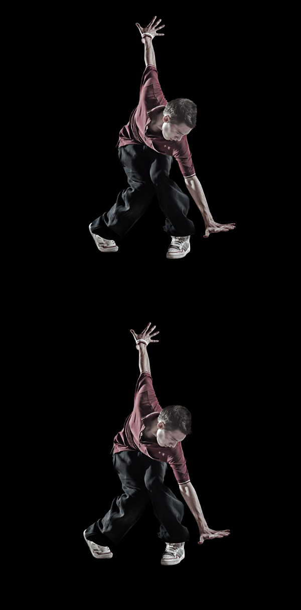
Final Image Preview
Take a look at the image we'll be creating. Want access to the full PSD files and downloadable copies of every tutorial, including this one? Join Psd Plus for just $9/month. You can view the final image preview below or view a larger version here.Tutorial Details
- Program: Adobe Photoshop CS3
- Difficulty: Advanced
- Estimated Completion Time: 45 minutes

Preparation
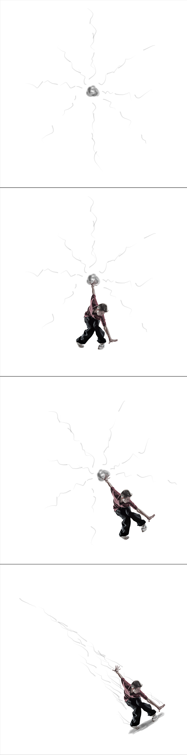
This is an advanced piece, I mean there are no hard to do techniques, but this kind of work requires a lot of good taste, some color experience and casting shadows knowledge. So I do not recommend this tutorial for beginners. I'll skip basic pointers and go straight to the main point. Basically, I want you to get the idea of how to create an illustration like this and follow your own way with these effects.Before we start, I wanted to show you how the concept changed during the whole session:
- This first image below is the main concept, that I planned. It's the first idea that came to my head: an energy ball with lots of shine lines around it.
- While searching images I accidently found an image of a man in a very cool position, so I thought this must be used here. So I put him there and wanted to make an illusion that this man is creating all the energy.
- The first plans were done and I started to work on this project. During the process this concept somehow lacked dynamics, so I decided to rotate the whole piece.
- Finally, when I had no idea how this energy ball could look like, and this took me some time before I came up with the final idea, I rejected the ball and went into energy touch only for this man.
Step 1
Before we start, you need to know that the shining effects work best on a black background. The darker the background is, the more visible and contrasted shine you will achieve. So I started with a black background of the canvas around 900px by 1100px (this should work for you fine).
Step 2
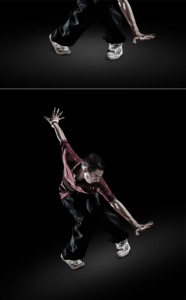
Now is the first hard part, searching for the right image. I know many people are unhappy with buying pictures, but well, the truth is: if you want good quality, you need to pay for it. I've nothing against free stock photos, if you have the time to search for a good image among mixed quality free pictures it's OK.Anyway, if you have the right image, then extract the person (or object) from the image of your choice. The biggest problem of all cut-outs is always the hair. But, as you can see in the image below, I had a short haired man. In this case I simply used the Pen Tool to deal with short hair. And because we have a black background in our main project document, we can easily blend this black hair with the background. To do this I used the Burn Tool with Range set to Midtones and burned the hair edges a little.
Step 3
Now, in the Layers Palette I added two adjustment layers: Levels and Gradient Map to make a better blending between this person and the black background. I used a gradient from black to white and set the Gradient Map layer's Blending Mode to Soft Light, then lowered the Opacity just a touch.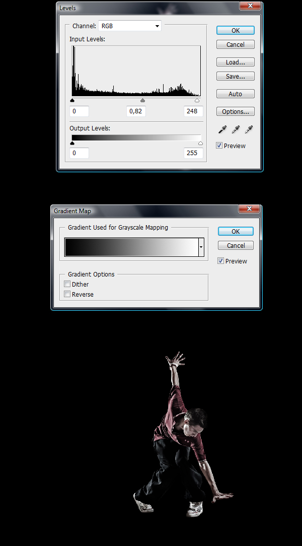
Step 4
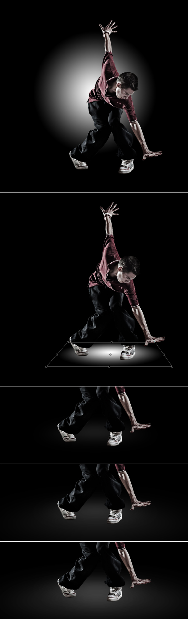
OK, next we'll create ground. I used a Gradient Tool and on a new layer created a radial gradient from white to transparent (as you see in the first picture below). Then this big white dot needed some perspective, so here I hit Command + T to Distort (second image below).The dot was blurred using Gaussian Blur at around 40 pixel Radius. Then I duplicated this blurred dot, stretched it a little bit (Command + T) and made two more copies to enhance the ground effect. If necessary, the opacities of these ground layers can be lowered just a touch. It means that this surface shouldn't be too bright, as this will kinda destroy the concept of having the whole background black.
Step 5
Now, as you can see in the first image below, I started adding shadows under the shoes. It's not suppose to be great and totally pimped shadow. I just needed to make an accent that this man is standing on something. This always works pretty well, as you start to see how your illustration is shaping up, even thought the shade will change, it's good to have it sketched.To do the shadow I used a black brush with Flow set to 2% and Hardness to 0%, then I slowly started creating it click by click (don't hold the left mouse button while doing this, as you may make a very ugly kind of shadow that way). Individual brush clicks did the job just fine.
Now let's focus on the second image below. Something didn't work for me in this piece, so I decided to add the first dynamic touch to this illustration, so I selected all the layers and used Command + T to rotate them at a small angle (for now it looked kinda like a slip).
Step 6
I zoomed out and positioned this man and ground to the right. I kinda wanted to avoid the center focus of illustration. Sometimes it's good to move the main object/person to the side, looks more dynamic and original to me.OK, then I decided that this position works perfectly for this piece and started touching up shadows. Looking at this man it's visible that few sources of light hit him (for example his left hand shows that light reaches it from left and right). So in this case I decided to give this man a soft shadow, only underneath him by using the same technique as previously.
I only want you to pay attention to his shoes which are the closest objects to the ground. Shoes stick to the surface, this means they need more shadow around them. The farther the objects are from the ground, the more they start to disappear (and the shadow starts to soften, then slowly vanish).
Step 7
As I was watching my illustration now, I felt like there are some spots that are too bright, so I used the Burn Tool to enhance the shade effect of the shoes. I also did some blending with the hand, as It seemed too bright on the left side.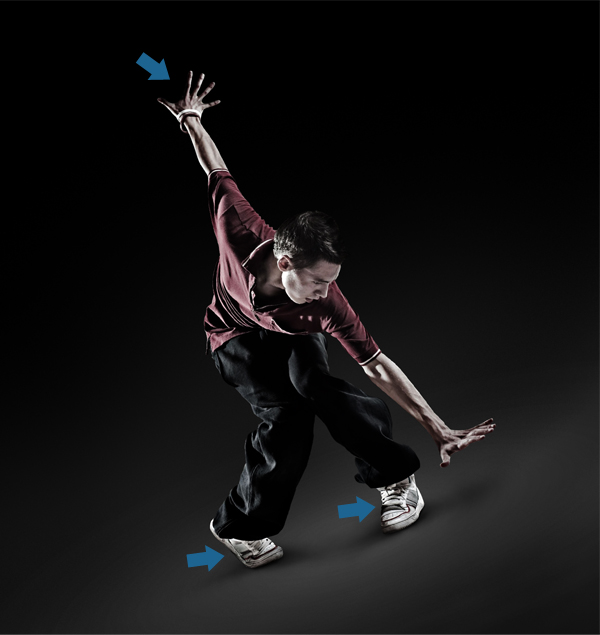
Step 8
Finally this man is ready. Now this illustration needs to look more like one piece. So I did some overall color adjusting. I added a Curves adjustment layer and then a Gradient Map with a Violet to Orange gradient (picked from standard presets). Then I lowered the Opacity of the Gradient Map to around 25-30% and changed its Blending Mode to Soft Light. Both adjustment layers were set up to give this illustration a yellowish touch (as I experimented and liked it).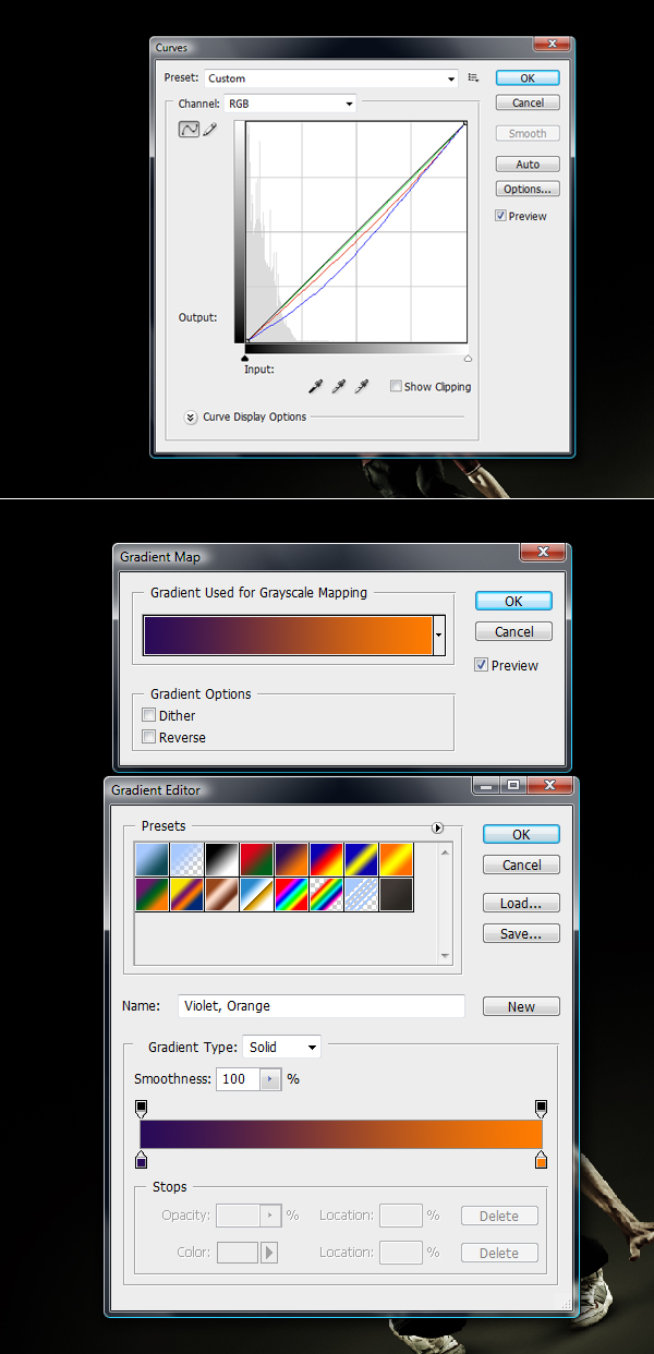
Step 9
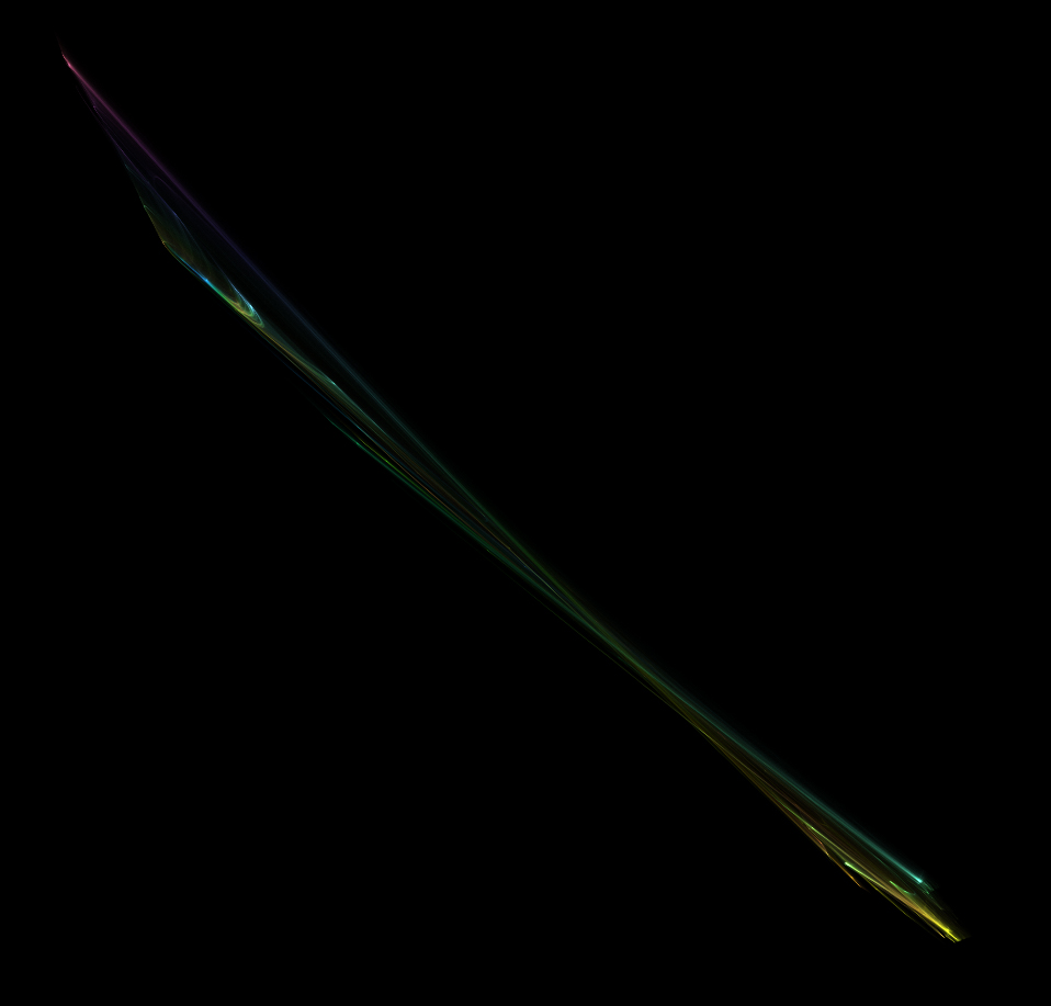
Now it looks like this man really belongs to this place, and that's the thing we want. Next, I started all the light tricks.Here is something abstract that I prepared for this piece. So I opened these lights and dragged them into the project while changing its Blending Mode to Linear Dodge. It was put above all layers just not to get colorized by two previous adjustment layers.
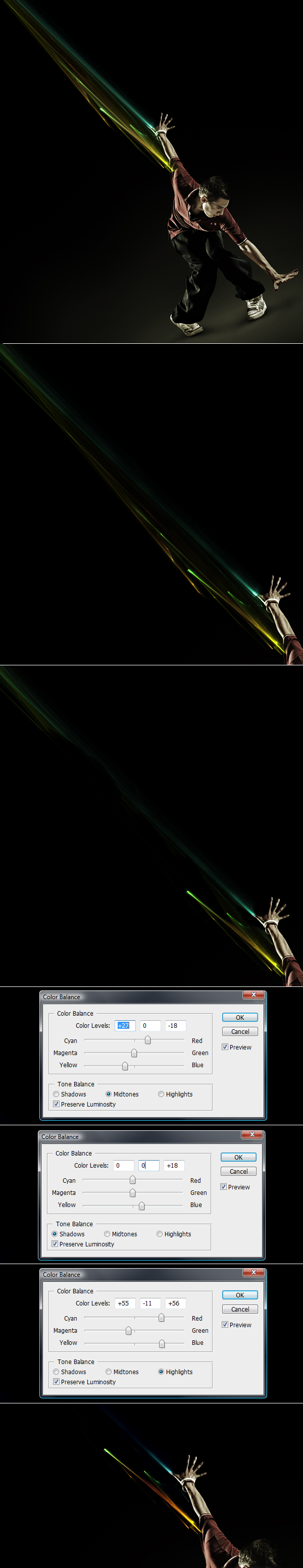
Now look at the process. As I already had these abstract lights, I took the Burn Tool (Midtones) and burned parts of this piece that I wanted to get rid of (2nd image below). Then many less of these lines lasted, so I used a hard Eraser Tool to erase the rest of the disturbing lines, which I didn't want to see here (3rd image below). Finally I added Image > Adjustments > Color Balance and adjusted this color exactly for these three main lines (blue, green and yellow). I worked to achieve cool, bright coloring for these lines.
This can be done for each line separately, but before that they need to be cut out into new layers.
Step 10
As I said, if you don't have some color experience, this tutorial will be difficult for you to follow. Now is the further part when I repeated the same process as in the previous step. I created, erased, separated new lines and added various colors.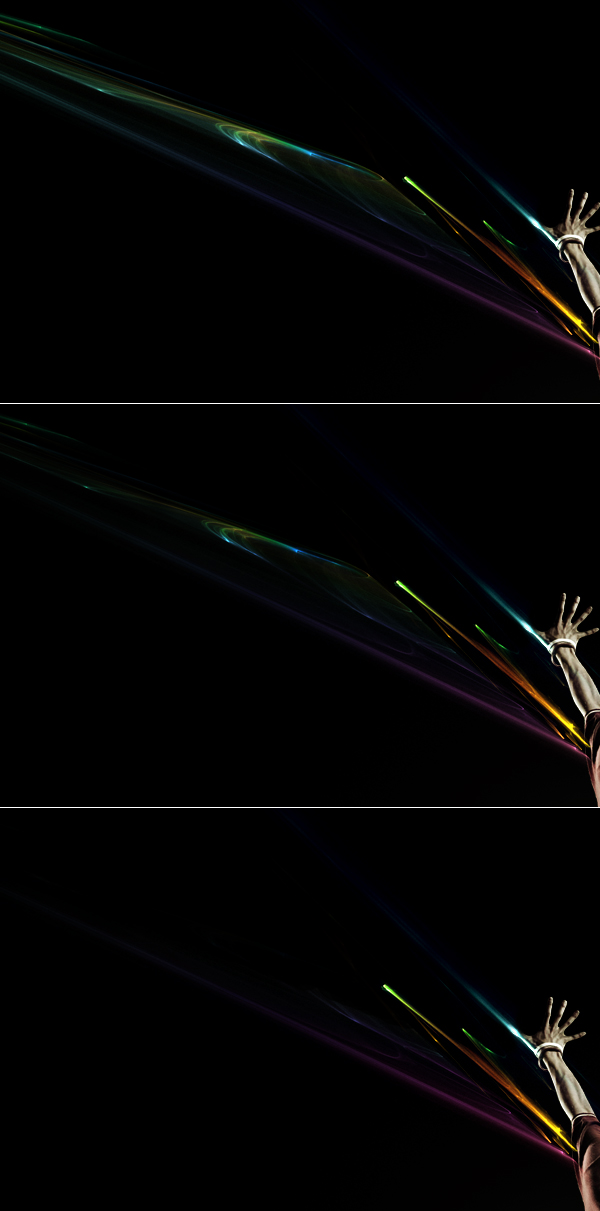
Step 11
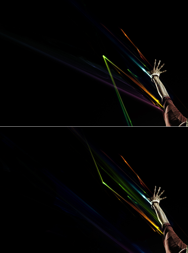
I was still into adding color light lines, and I want to show you another example of flexible work. During this process I had many ideas of how to connect and set these lines.First I thought maybe a good idea would be to cross them and make them in different positions (1st image below). This didn't work out and I decided to make all the lines almost parallel (2nd image below). So I made it, and for some variation I added one green line that kinda crossed the space, but it gave some depth to the illustration so I left it be.
Step 12
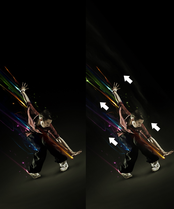
Now I added some more brightness in places indicated below using soft white brush. The new layer was created below the lines layers, as these lines are half transparent (cause of the linear dodge mode), so everything put below these lines is visible.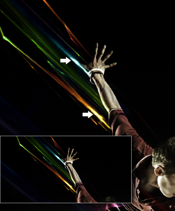
Step 13
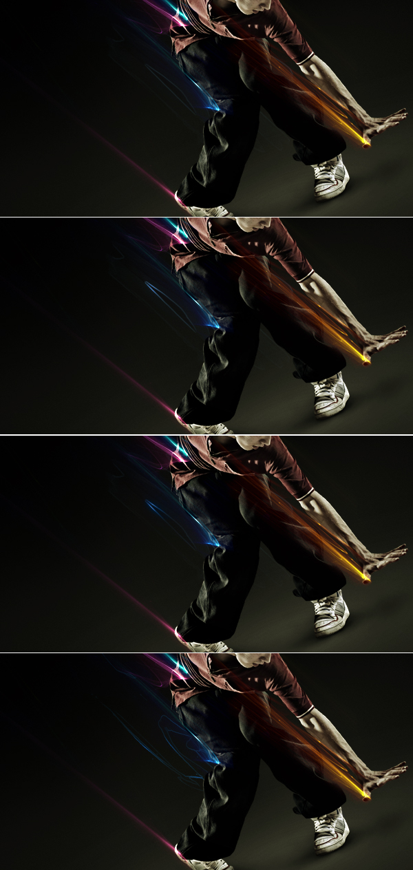
I played around with these lines and achieved some cool results (first image below). All done the same way as I showed previously.Next I felt like this piece needs some more details going all around it and filling in some blanks. You can find some similar brushes to the ones I used for this. Experiment with various brushes in this step.
I picked one my grungy splatter brushes. Then found a nice dark color (coming from the color that I used in light lines - in my case it happened to be blue) and made a brush mark (second image below). Then I brought up the selection of this brush mark and contracted it by 2 pixels by going to Select > Modify > Contract (third image below). Next I hit Delete to get rid of the center brush part (forth image below). Then I positioned it near a light blue line.
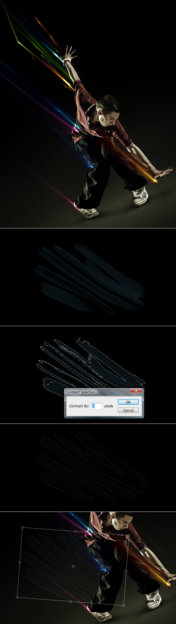
Step 14
Now as I had this brush mark placed correctly, I used a soft eraser and erased disturbing parts. Then switching between the Burn Tool (Midtones) and Dodge Tool (Highlights) I pimped out selected dark spots of this brush mark.When using the Burn Tool you actually darken the spot. When using the Dodge Tool, you brighten it up. So I was very careful in this step, a small overdo can destroy the idea.
So this process is just to show you how it works, the brush mark in the first three images below are just an example. In the forth image below you can see the brushes that I used originally.
Step 15
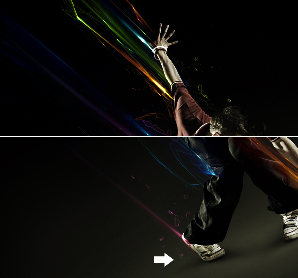
By the way we're still with these brushes, pay attention to the little pieces above the man's head (first image below) and the ones near his leg (second image below). Yes, they were made the same way as previously. To do this you can even use some splatter brushes and follow the same process.Also pay attention to the second image below. I indicated a spot that points to shadow. This shadow made an illusion that these little pieces are in the air. So if you get more small pieces around the ground, you can cast some shadows underneath them (but on the ground) and this will give your effects more depth.
Step 16
Next to to add some sparkle to this illustration I decided to use a picture of sky and cut the sun out of it. Then I desaturated this piece (second image below) and set its Blending Mode to Linear Dodge and I erased all the unnecessary parts around this sun (with the Eraser Tool). I also brought up the Levels (Command + L) and enhanced the contrast. Then I used Burn Tool (Midtones) to enhance the light effect and darken the rays (fourth image below). Finally, I colored this sun using Hue/Saturation and Color Balance, I made it green and then gave it a touch of yellow.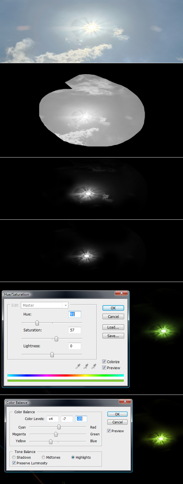
Step 17
The sun was resized down to a very small size, and at this size it completely stops being recognizable as a shining sun. Now it's just a shining spot. I duplicated it many times and placed it in various spots. By the way, I changed the color when it was necessary to make these lights fit. To change colors I followed similar steps as before (basically Hue/Saturation and when the tone was not fully satisfying I pimped it with Color Balance).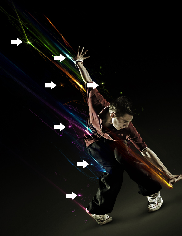
Step 18
Moving forward I thought I'd use these nice clouds of this sky to make some dust. So I opened the image and desaturated it. Then (as previously) I used Levels (Command + L) to make the clouds stand out. Next, I used a soft Eraser and got rid of unwanted parts (fifth image below). Finally, I grabbed Burn Tool (Midtones) and made some touch-ups to these clouds. I kinda separated them and brought them up more.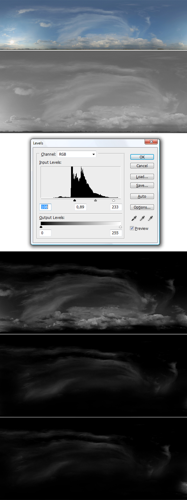
Step 19
I named these clouds "Dust" and changed the layer's Blending Mode to Linear Dodge. Then rotated them and placed them towards the lines direction (as you can see in the image below).I made a small comparison below, the whole illustration got a little bit smoother when I added this dust.
Step 20
So the illustration was almost finished, but the light lines were still not blended enough with the model. I hit Command + A to select the whole canvas, and then Command + Shift + C (copy merged) and Command + V (paste). This way I made a duplicate of the whole image and put it on top of all the layers.Then while having this image selected, I went to Filter > Liquify and as you can see in the first image below, I did some stretching using the Forward Warp Tool (in Liquify filter). In the second image below you can see how smooth and nice these lines were blended.
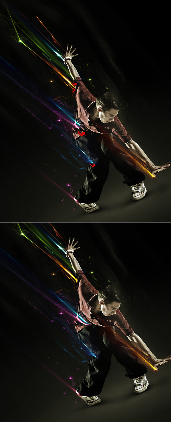
Step 21
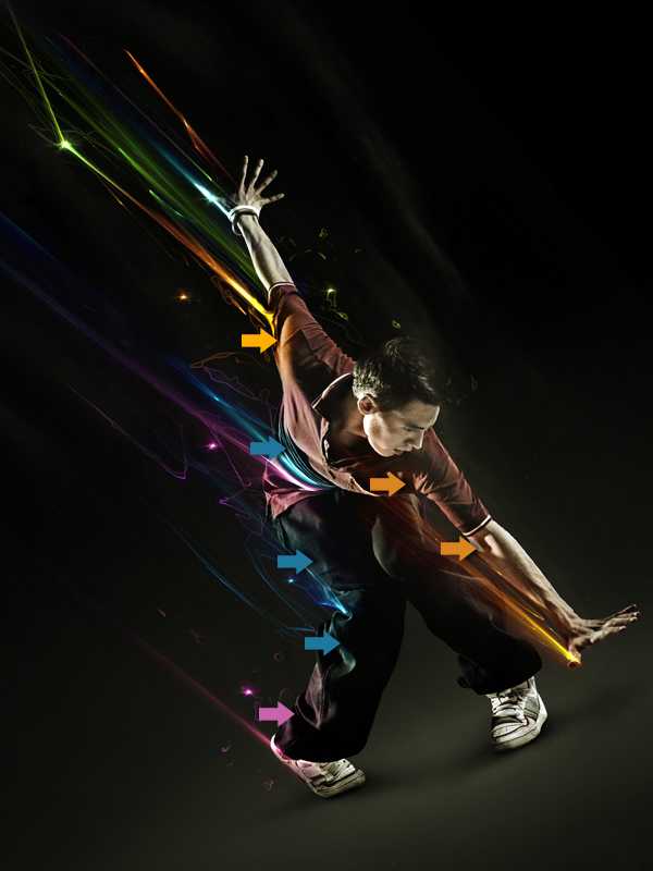
As the final touch I wanted to give this piece a little more realism, so I casted light reflections on this man's clothes and skin. Each arrow below has the color of the nearest line. For example, the first orange arrow point of the shirt spot which should be affected by the orange light line. So I gave an orange color to this spot, and so on with the others.To do that I made a new layer with the Blending Mode set to Color (Soft Light in some cases works fine also), then I used a very soft brush with proper color, and Voilà!
Conclusion
In the end you can give it a nice overall sharpen using highpass filter, this will bring even more quality to your work. So I hope you liked this piece, thanks for reading. The main purpose of this tutorial was to show you a good direction in how to use these effects. So be creative and try to discover your way of using them.You can view the final image below or view a larger version here.


0 Comments::
Post a Comment