is much easier to criticize somebody else’s work than to create something cool yourself. But if you apply a systematic approach to criticizing, make a numbered list and prepare illustrations, it will be regarded as a fully-fledged analysis! In my opinion, icon design is undergoing a transitional period. On the one hand, screen resolutions are increasing, hence enhancing icons. On the other hand, we still have good old pixels. Icons sized 16×16 and even smaller are still widely used. And so, here are the most commonly observed mistakes in icon design…
#1 Insufficient differentiation between icons
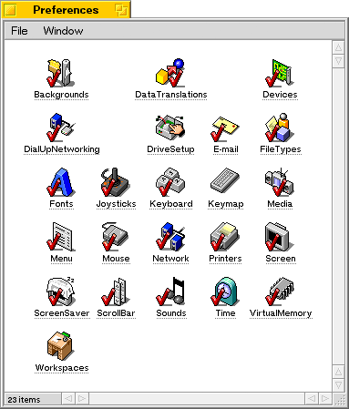
Sometimes within one set of icons, we have icons that look alike and it is very hard to understand what is what. If you miss the legends, you can very easily get the icons mixed up.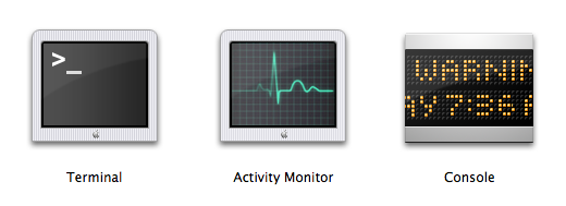
Icons from the Utilities section in Mac OS X. I am always getting them confused and launching the wrong application.
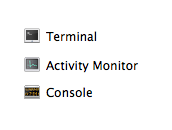 The problem is aggravated by having small size icons displayed on screen.
#2 Too many elements in one icon
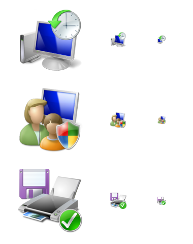
The simpler and more laconic the icon, the better. It is preferable to keep the number of objects in a single icon to a minimum.Nevertheless, Microsoft’s designers, inspired by the new format of icons featured in Windows Vista, decided to go big and drew bloated icons to justify their bloated budget:
 Each icon presents us with a mini-story with an intertwined plot. The problem is that in small size you are unable to work out what is depicted. Even in larger sizes, it is not always that easy to decipher the icons.
#3 Unnecessary elements
An icon should be easy to read. The fewer elements it has, the better. It is better if the whole image is relevant and not only part of it. Therefore, you have to pay attention to the context of using icons.Let us take for instance some database icons:
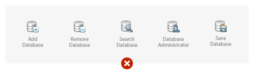
At first glance everything looks alright.
But if this application (or a separate toolbar) deals only with databases, we can (and should) remove the unnecessary part:
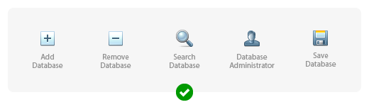
The sense is not lost here but the icons become much more discernible.
Here is a real-life example of unnecessary elements occurring in BeOS 5 icons:
Ticks here are absolutely superfluous. By the way, why are they done in red?
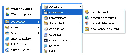
#4 Lack of unity of style within a set of icons
It is a unity of style that unites several icons into a set. The uniting property can be any of the following: color scheme, perspective, size, drawing technique or a combination of several such properties. If there are only a few icons in the set, the designer can keep some rules in his head. If there are many icons in the set and there are several designers working on them (for instance, icons for an operating system), then special instructions are created. Such instructions describe in detail how to draw an icon so that it fits straight into the set. A multitude of styles in the shell32.dll file in Windows XP. This is the default set of icons suggested to a user wishing to change an icon.
#5 Unnecessary perspective and shadows in small icons
Progress does not stand still: interfaces have gained the potential to display semi-transparent objects, lost the limitation on the number of colors and there is now a trend towards 3D icons. But is it really all that useful? Not always! Especially if we are talking about icons sized 16×16 or smaller.For example, let us take the application manager from GNOME 2.2.0 (RedHat 9):
Perspective in icons of such minute size is unnecessary and even counter-productive.
And here is the application manager from Windows XP:
As standard, icons in Windows XP are given a two-pixel black shadow; but in 16×16 size the shadow appears too large and makes the icons look dirty. The Address Book icon looks especially bad in this set.
#6 Overly original metaphors
Selecting what is to be displayed in an icon is always a compromise between recognizability and originality. Before a metaphor (image) is developed for an icon it is wise to see how it is done in other products. Maybe the best solution lies not in coming up with something original but rather in adopting the existing solution.An example of excessive originality is the bin icon in OS/2 Warp 4, which is not actually a bin at all but a shredder.
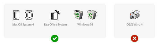
Another problem with choosing a shredder is that there is no one well-known type of shredder out there. The icon appears very much like a printer with an octopus hidden inside. What is more, it is absolutely unclear how a full bin would be displayed according to this metaphor.
#7 National or social characteristics not being taken into account
It is always necessary to take into account the conditions in which your icon is going to be used. An important aspect here is national characteristics. Cultural traditions, surroundings and gestures can differ radically from country to country.Let us suggest that we need to draw an icon for working with e-mail. It makes perfect sense to use a metaphor of real paper mail. A mailbox for example.
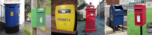
These images are courtesy of the Wikipedia article entitled Post box.
The answer can be found in the manual on creating icons for Mac OS X: “Use universal imagery that people will easily recognize. Avoid focusing on a secondary aspect of an element. For example, for a mail icon, a rural mailbox would be less recognizable than a postage stamp.”
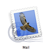 The idea of using a stamp is great but the use of the
#8 Images of real interface elements in icons
The manual on creating icons for Mac OS X warns us: “Avoid using Aqua interface elements in your icons; they could be confused with the actual interface.” But all in vain! For instance, take a look at the following icon: You reach out to click on the radio button but end up clicking the whole icon!
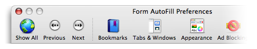
Pay attention to the Previous and Next buttons, a rare type of button with legends underneath. Oops! They are not buttons at all, they are icons!
#9 Text inside icons
This mistake is commonly seen in application icons. Clearly the first thing that comes to mind when working on an application icon is to adapt the application’s logo. What is so bad about the text inside the icon? Firstly, it is directly language-related and so impedes localization. Secondly, if the icon is small, it is impossible to read the text. Thirdly, in the case of application icons, this text is repeated in the name of the application.
#10 Outside the pixel framework
As a rule, this problem occurs if you use a vector editor for drawing icons. In large size everything looks pretty and clear; but in reality the icons are small, and under rasterization anti-aliasing frets the objects’ borders.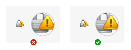


0 Comments::
Post a Comment