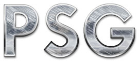
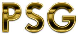
3D GOLD METALLIC TEXT

This effect can be produced by any version of Photoshop; using the steps outlined below. Hopefully, everyone will come away from this tutorial with a better understanding of just how simple it can be to create a variety of effects from one image; without the aid of special plug-ins.
1. New document |
Create a New Document. Attributes: 300x150 pixels / RGB / White Background.
2. Add text |
Click the Type tool and type a short word. I used the letters PSG. Take note that really thin fonts won't work real well with this. Use a medium to thick font face. Make your text large enough to fill most of the canvas area, but not all of it. My type was set at 100 pixels. Before going on, Render or Rasterize your type layer now.
3. Choose a multi-leveled gradient for a metallic effect |
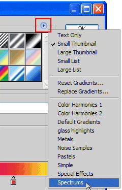 In order for this effect to come off well, we need to use a 'multi-level' gradient -- i.e. a gradient which contains more than 2 shades of color. Photoshop has several of these already built into it's default gradient library. Start by picking the Linear Gradient tool, then open the options palette for the tool. Users of PS5.5 or earlier, can double-click the tool to open its Options palette. PS6/7 users just click the preview image on the left side of the Options Bar. Within the gradient library, choose the preset library named "Spectrums" (see example image on the right).
 In PS5.5 & earlier, "Spectrum" is a single gradient style found within the gradient Options palette, so you guys choose that one;
In PS6 & above though, "Spectrums" (plural) is a small group of styles. In this case, you users need to choose the single style called "Spectrum", from within this group. So load-in that group now and choose the correct style.
4. Apply the gradient |
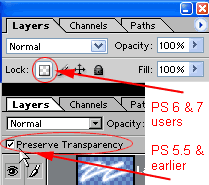 Start out by naming your main type layer text 1. Then check that the 'Preserve Transparency' option has been ticked ON for this layer. PS6/7 users must "Lock" the layer. (See example image.) Now, click the Linear gradient tool at the bottom of your text and drag it to the top. Hold the Shift key down while dragging so the gradient will be perfectly straight. One thing we need to do is remove the color. So now, under the 'IMAGE/Mode' menu, convert the document to Grayscale. When/if asked whether to Flatten the document first, say no. This step removes the color. from our gradient, while maintaining it's tonal qualities. Now convert the document back to RGB mode, under the same menu. And again, say no to Flattening the document; if asked.
 5. Thicken the metal |
We'll shrink each new copy a bit, and change the blend mode used.
This will create our main 3D effect.
- Ctrl/Cmd-click the 'text 1' layer to select the type. Contract the selection 5 pixels, then press Ctrl/Cmd+J. Set this new layer's Blend Mode to 'Color Burn', and name it 'text 2'.
- Ctrl/Cmd-click the 'text 1' layer again, to re-select the type. Contract the selection 3 pixels, then press Ctrl/Cmd+J. Press Ctrl/Cmd+I to invert the colors of the gradient. Now set this new layer's Blend Mode to 'Hard Light', and name it 'text 3'. Then move this layer above the 'text 2' layer.
- Now we're going to create some edge highlights. Select the text on the 'text 3' layer. Create a New Layer and name it 'highlights'. Then Stroke the selection with White, by 1.5 pixels, on the Outside. Set this layer's blend mode to 'Overlay' and lower the Opacity to 85%.
- Now we need to strengthen our reflection effect a little. This is simple to do. Just duplicate the 'text 2' layer, and move it to the top of the palette. Then set its blend mode to 'Overlay'. Rename this layer 'text 4'.
- As well as strengthening the reflections, we now also need to brighten our text a bit, it's a tad too dark at this point. Again, very simple. Ctrl/Cmd-click the 'text 3' layer to create a selection of the type. Now create a New Layer and make sure it's at the top of the palette. Then fill the selection with white, and change the blend mode to 'Overlay'. Now lower the Opacity to 50% (MAC users: lower this to 25%), and name this layer 'brighten'.
- Now... all that's left to do is color. our type. For that, we need to duplicate the 'text 1' layer, move this to the top of the palette, and fill it with a goldish color. -- try this one: R/192 G/161 B/65. Then set the layer to the blend mode 'Color'. You can then modify/fine-tune this color. further using the Hue&Sat filter if you wish -- by adjusting the Saturation slider only.
(For brass look, use the Hue&Sat filter on the color. layer, and lower the Saturation to 35.)
 Oh and of course, one last thing I did to help the effect...
I added this image on a new layer right below the color. layer. I set this layer to Soft Light, at 60% Opacity. And I used a selection of the 'text 1' layer as a Layer Mask. This serves as a general reflection within the metal's surface. You can leave this layer as is, even if you change the metal to something else; like steel or brass.
Now just add a drop shadow, and you're all set! You should keep in mind too, that yours will not look exactly the same as mine. But it should look somewhat similar.
T I P S
 Other colors can also work here to produce different types of metals. Experiment to see what different types of metals you can come up with, by simply using a different color. For a straight chrome or stainless steel effect, just turn off the colored layer we made. Then follow these steps:
 - Duplicate the 'Text 3' layer, and rename it to 'scratches'. Then move this layer just above the 'highlights' layer in the palette.
- Ctrl-click the layer to create a selection of the type.
- Fill the selection with White, and then add noise / Amount=100 / Gaussian / Monochrome.
- Apply a Motion Blur to the layer at a -34 degree Angle / Distance=15. Emboss the layer / Angle= -145 / Height=7 / Amount=150.
- Deselect the layer, and set the Blend Mode to either Lighten, Exclusion, Overlay Soft Light or Hard Light, at 25-50% Opacity. Each blend mode creates a different look -- you choose!
- And last, duplicate the 'text 3' layer again. Leave it where it is; right above the original, and rename it 'chrome' The example shown here uses Lighten mode, at 50% Opacity.
Playing around with the the layer Blend Modes can yield some different results also. Try changing the Blend Mode for the 'Text 3' layer and see how the effect can change.
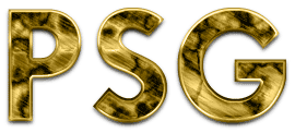
 Other effects can be achieved too by simple means. Such as this effect here. Try these steps to produce this 'old brass' effect on yours: (reset the blend modes if you changed them in Tip #2 above)
First off... make sure the 'chrome' & 'scratches' layers are not visible -- hide them. Then duplicate the 'Text 3' layer. Press Ctrl/Cmd+I to invert the shades of the gradient. Then apply a 2 to 3 pixel Gaussian Blur to the layer; make sure the type is not selected. I used 2.5 pixels for mine. Then set the layer's Blend Mode to Difference. And finally, use the Move tool and nudge this layer down 3 pixels.
Now from here it gets very easy... duplicate the 'text 3 copy' layer, and invert the shades -- press Ctrl/Cmd+I.
If you want to see a slightly different variation on this look, hide the original 'text 3' layer now.
See how easy this is!?
 And here's one final example of what a little experimenting can get you. All I'm going to tell you here for this one is that it involves using the Clouds/Difference Clouds filter, and the Difference blend mode. It's not that difficult. So see if you can figure out how I got the previous 'old brass' effect to look this way.
 Have fun!


0 Comments::
Post a Comment